For service level to have meaning, you must view it over an appropriate time frame. Daily service level reports often conceal important information. Service level can take a big hit in the morning, but if you have staff handling every contact immediately much of the afternoon, the daily report may look fine. The level of service from customers’ perspectives is a different story.
Managers who are held accountable for daily reports have an incentive to manage inappropriately. If the morning was rough, they may keep agents plugged in and handling the work through the afternoon just to make the reports look better. That’s a waste of time and resources, and it doesn’t help customers who encountered poor service earlier in the day.
If daily reports are potentially misleading, monthly averages for service level are virtually meaningless. They simply don’t reflect the day-by-day, half-hour-by-half-hour realities. Monthly reports that aggregate data remain an all-too-common way to summarize activity to senior management.
“If daily reports are potentially misleading, monthly averages for service level are virtually meaningless.”
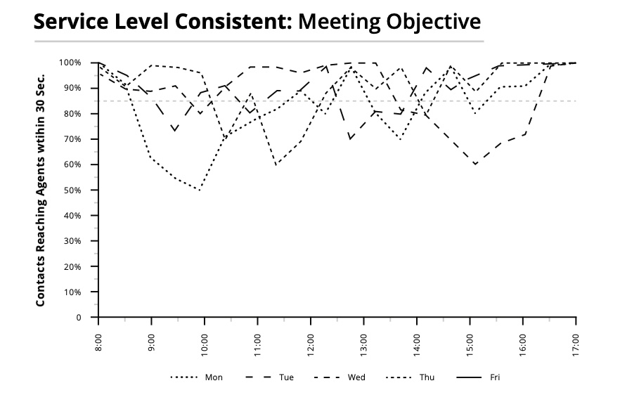
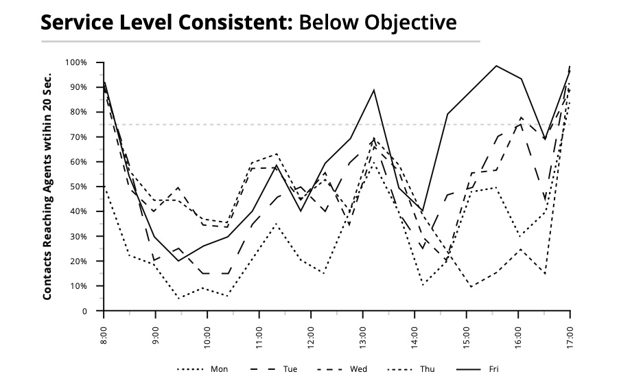
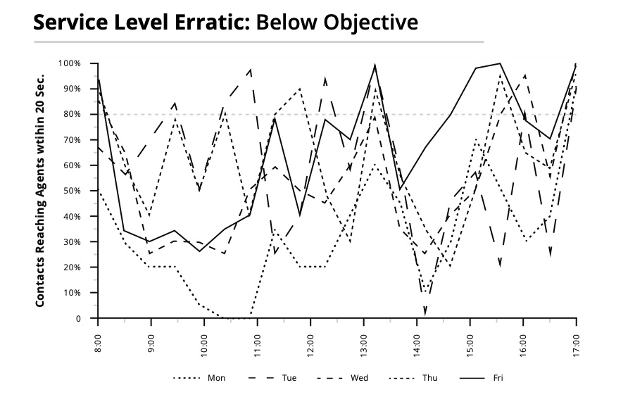
The following charts represent agent groups in three different contact centers. Because these graphs display actual results by half hour (not results for a single day or averages for a week or month), they can expose recurring problem areas. (Note: the hours and days of operation are different for each, as are their service level objectives, represented by the straight lines near the top of each chart. Each example represents a specific week.)
The first graph illustrates a fairly consistent service level that is centered on the organization’s target of answering 85 percent of contacts in 30 seconds (minus a few short-lived problem areas). You are striving for a fairly consistent, on-target service level such as this. Yes, it looks a bit variable, but because service level is a high-level report, these graphs won’t show stable, repeating patterns usually inherent to handling time or volume graphs.
The next graph illustrates a service level that … um … isn’t so hot. You can see that service level is relatively consistent from day to day but well below the organization’s objective of answering 75 percent of contacts in 20 seconds. It dips mid-morning, mid-afternoon, and around lunchtime, probably as the result of breaks and lunch.
The next figure reveals an erratic service level that is usually below the organization’s objective of 80 percent answered in 20 seconds. This may be an indication that the resources to meet the objective are adequate, but that they aren’t in the right places at the right times.
There are probably inconsistencies in how agents are handling the workload. Further, agents may not understand or have information on service level.
And remember, reports only tell you what is happening to the contacts that get through. If your contact center uses busy signals or messages to deflect work, then service level must be interpreted in light of contacts that aren’t getting through.
Excerpt from Contact Center Management on Fast Forward by Brad Cleveland.