Making sure customers can find all the information they need with minimal effort needs to be a priority.
You are probably well aware that quality customer service is very crucial. After all, customer support is responsible for the direct connection between your customers and your business, making it one of the most important factors for success. But you probably know that quality customer support is expensive and very time-consuming too, so what can you do about it?
In this article, I will show you few tips you should use to redesign your website and improve your user experience to decrease the number of support tickets = saving support agents time = saving money.
Create a Killer Knowledge Base and FAQ
Your customers are open and willing to use self-service channels to find the answers and support they need. 91% of survey respondents said they would use an online knowledge base if it were available and tailored to their needs. 40% of customers contact a call center after they have looked for answers via self-service.
The takeaway for this is that a large number of support tickets can be reduced if your business provides specialized user-centric self-service. In other words, you have to provide a user-friendly knowledge base where your users can find answers quickly with no need for help from your support agents.
So, how should you go about improving it?
Improve Your FAQs and Knowledge Base with Heatmaps
Can your customers even find your FAQ? Do they scroll down to the most important answers or the most common issues? Are they clicking on elements that are not clickable? You can use Click, Scroll, and Move Heatmaps to figure out answers to these questions.
Heatmaps will allow you to find out which parts of your knowledge base and or FAQ get clicked the most, giving you a fair idea of what users need help with or which issue they struggle with the most often. This is very valuable insight and with the help of Scroll Heatmap which will show you how far down the page users scroll you will get a very good idea of how your knowledge base and FAQ should be redesigned. Put the answers that get the most tracking on top, so you make sure it doesn’t go unnoticed by your customers.
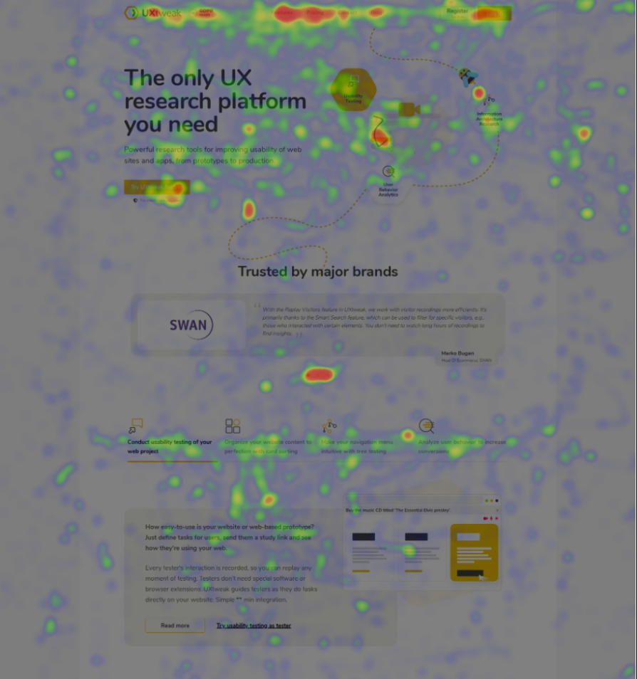
Move heatmap to show you areas of your website where people stop with their cursor. The majority of people point the cursor at the area they’re currently looking at. This is also supported by research that found a correlation between cursor and gaze position, meaning move maps are a good substitute for eye-tracking.
If you made sure your Knowledge base and FAQs offer exceptional user experience and are easily and intuitively accessible, you may try additional ideas to reduce the number of support tickets even more.
Improve Your Menu Navigation and Site Structure
Your customers want their problems resolved as easily and quickly as possible. You need to make it easy for them to get help without bouncing them around your site. Making sure customers can find all the information they need with minimal effort needs to be a priority.
The website has to be intuitive, easy to navigate, and contain answers to all the possible questions visitors might have.
- Are your users expecting to find your FAQ section in the “HELP” or “Resource” category?
- Are they able to navigate your knowledge base?
- Do they understand the way your website is structured?
To make sure your users don’t get confused with the information architecture of your website, you should find out their expectations and have a clear understanding of the way they think. This will allow you to improve the user experience on your website.
Great methods for improving navigation and site structure are card sorting and tree testing. They work the best when used one after another.
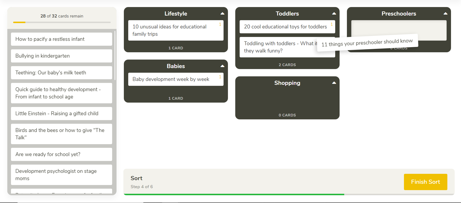
Card Sorting
Card sorting is a popular research method that allows you to find out how your visitors conceptualize and categorize the information on your website. Simply put, card sorting will help you find out how you should label and group your content, so it makes sense to your users.
Using Card Sorting to Create Intuitive Menu Navigation
Card sorting can be easily used to create understandable menu navigation. The way you would set this up is – you would create categories that would represent the main pages of your navigation (eg. Home, Shop, Contact us, Blog…).
Then you would create cards that will represent the subpages that are part that go under your main pages (eg. Men Collection, Women Collection, Electronic, Sale…). If you have such a study prepared you would let your visitor sort the prepared cards into the categories letting you figure out where your users expect to find certain pages, thus helping you create intuitive navigation.
You can also use card sorting to improve your Knowledge Base. Knowledge bases or help sections tend to store a lot of information and it’s also critical for them to provide this information fast (as discussed in paragraphs above). This is a good example of when card sorting can help you sort all help articles. So, when a person lands in your help center, the right help is always easy to find.
To make this process easier, we recommend creating an online card sorting study with an online card sorting tool. This will allow you to create such a study in a matter of minutes. As well as provide you with useful metrics and visualizations to help you make the right decisions.
Tree Testing
Tree testing is a research method that will tell you how easily users can find information on your website. If users get lost or don’t know where to look for something, it tells you exactly where that is. It is a popular method for testing the effectiveness and intuitiveness of menu navigations.
You can use it to test your already existing structure or to test the navigation that was generated by a card sorting study allowing you to pinpoint even the slightest flaws. Tree testing is essentially a reversed card sorting and is used to verify the results you acquired with card sorting. To easily utilize the tree testing method try online tree testing tools.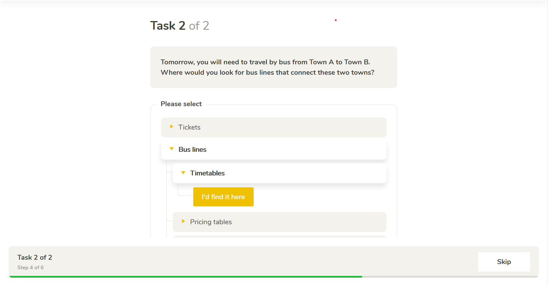
Test and Improve the Overall Usability of Your Website
When your site doesn’t provide a good user experience, it will often lead to 2 things. The first one is – the customer leaves your website pledging that he will never return or the seconding situation – bombarding your support agents with all sorts of the question because they are confused and don’t know what to do. This puts an unnecessary load on your support teams that could have been avoided and drives away potential profits.
How Can you Improve the Usability of Your Website?
First of all, you need to find out what is not working, which parts are confusing users, and uncover pain points. You do that by testing your website with your targeted user group. Then you will give your users tasks to accomplish your website and see how they do. The most accessible and affordable way to do usability testing is by using online usability testing tools. You can learn more about unmoderated usability studies and improving user experience in the Basics of Unmoderated Usability Testing.
How did you like this blog?