When you’re juggling feedback from multiple sources and various customer segments, customer experience survey data analysis can get very overwhelming, very fast.
That’s why today, we’re very excited to introduce the much-requested Reports section of the Delighted platform, which is made up of three features: Snapshot, Over Time, and Pivot Table. With Snapshot and Over Time, you’ll be able to visualize your survey results in presentation-ready charts instantly. Using Pivot Table, you can summarize your survey data in one user-friendly, interactive table. You can also use it to see the most frequently used keywords from your open-ended feedback to surface unexpected trends.
Reports works with every survey type (NPS, CSAT, CES, 5-star, Smileys, and Thumbs), and makes it easier than ever to evangelize your customer experience program across the company on a regular basis.
Use Snapshot and Over Time for CX survey reports
With Snapshot and Over Time, your team can understand how they’re doing at a glance. The built-in chart graphics make the quarterly and yearly reporting process easy.
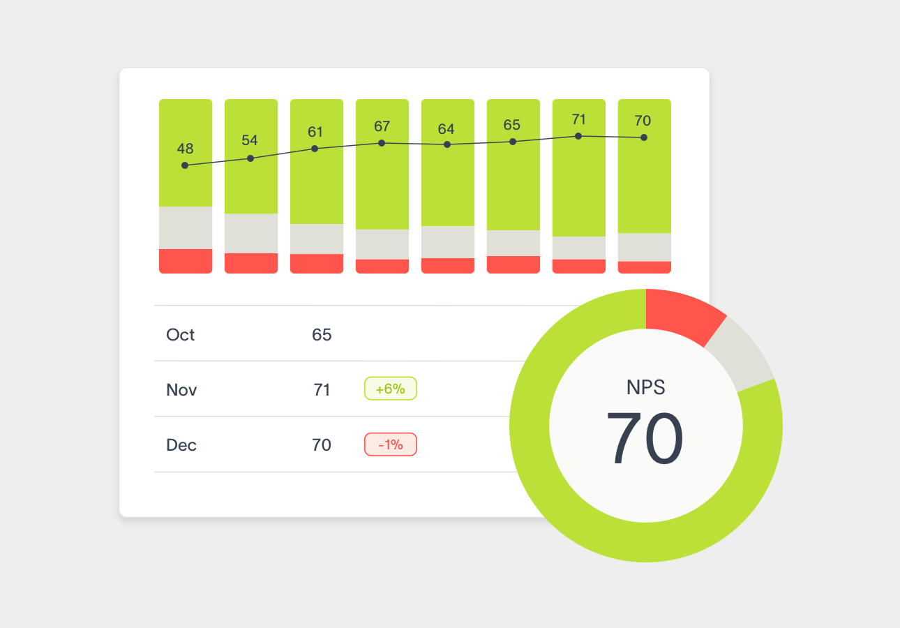
Because Snapshot includes both quantitative (donut chart, histogram, table) and qualitative (sample feedback) data, you get a comprehensive understanding of your overall performance, all in one place. Delighted intelligently shows the most meaningful comments based on length and key terms in your Snapshot Report.
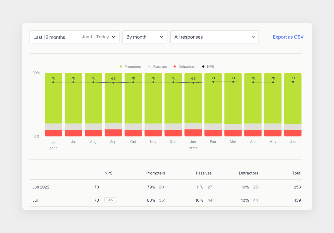
Filter the data by time frame and Trends or Properties to drill down to the exact segments you care about.
Over Time shows how the makeup of your score changes on a monthly or quarterly basis in a column chart and corresponding table, so you can immediately identify upward or downward trends and get ahead of them.
Once you segment the results with Properties or Trends, you’ll be able to pinpoint the exact product or service changes that have affected your customer experience scores (for better or for worse). Use Over Time to be proactive about potential problems before they get out of control, or bring positive changes to light.
Both Snapshot and Over Time can be filtered by time period, and by the Properties and Trends that you have set up to segment your survey data.
Learn more about Snapshot and Over Time in our Help Center.
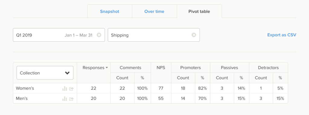
Use Pivot Table for survey results analysis
Pivot Table summarizes all of your survey data for analysis, so you can dive into how your Properties and Trends correlate to feedback scores.
For quick comparison, use just one filter to see how a Property segment (e.g. Agents, Locations, Products, Purchase Experience, etc.) performs.
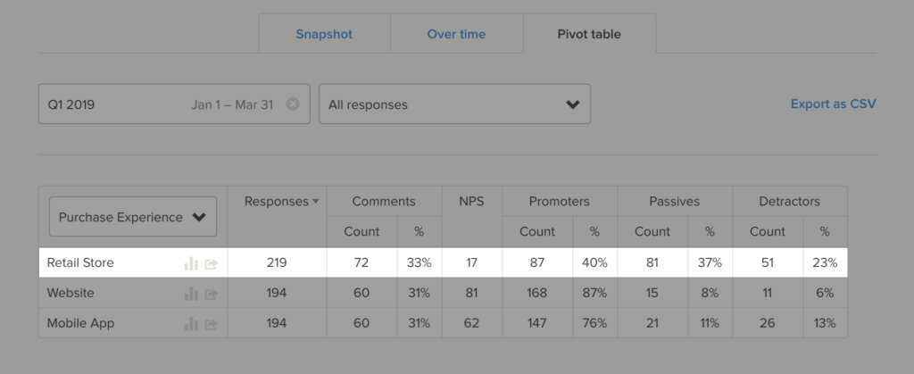
For deeper analysis, use two filters to drill down into different Groups, Trends, Properties, or Additional Questions. Analyzing the data this way helps you understand how important certain aspects of your customer experience may be to overall customer satisfaction, so you can prioritize working on the areas that will actually move the needle.
Pivot Table also has a bonus feature: Keywords. Keywords are a filter you can use to surface the most commonly used words in your open-ended feedback. That means you no longer need to read through all of your feedback to find patterns – Pivot Table automatically does it for you.
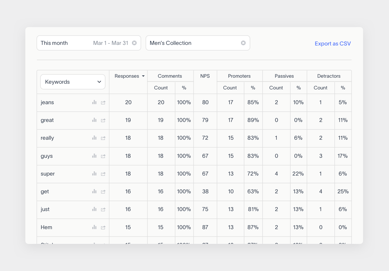
Discover which words are most commonly associated with positive or negative feedback, and then turn those words into a Trend to monitor how those scores change over time.
Learn more about the different ways to use Pivot Table here.
Reports is available at 2 tiers: Standard and Premium. Standard Reports includes Snapshot and Over Time. Premium Reports includes Snapshot, Over Time, and Pivot Table.
If you don’t have Reports yet, upgrade your plan here.